
BECOMING MORE HUMAN, ONE DATASET AT A TIME
If a picture is worth a thousand words, then Giorgia Lupi, an award-winning information designer, has written volumes. While “big data” has become a buzzword for many of us, Giorgia’s goal is to make data ‘smaller’—breaking it into human-sized, contextual pieces, expressing those concepts visually, then wrapping them in meaningful stories.
Her passion began in childhood. Without other siblings around to play with (or to pester), Giorgia often found herself spending hours being entertained by a piece of paper and a handful of pencils. Sometimes she’d even entertain her parents by ‘exhibiting’ her artwork at home, drawing on the walls just to get their attention.
Having grown up with a love of drawing as a young child, and after studying architecture and completing a Ph.D. in Information Design, Giorgia went on to co-found Accurat, a data-driven design firm.
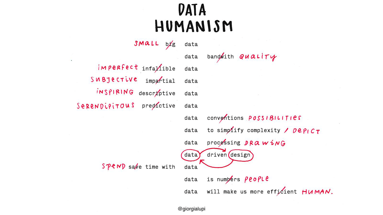
Giorgia is on an ongoing quest to explore how data can effectively draw out people’s humanity—to help them connect with themselves and others at a deeper level. Giorgia views big data as something that “no longer [exists in] a utopian future. It’s a commodity. And the more ubiquitous data becomes, the more challenging it will be to make it personal.”
In 2013, a chance encounter at a data design festival sparked a remarkable collaboration. Like Giorgia, information designer Stefanie Posavec also preferred hand-drawn data visualizations over the use of standard, data coding systems. They decided to embark on a challenge to see if they could get better acquainted through the exchange of ‘data drawings.’
Stats that tell a story
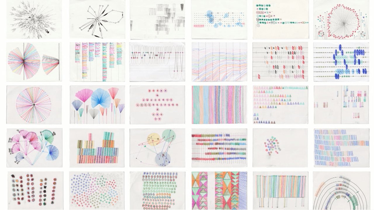
For 52 consecutive weeks, Giorgia and Stefanie put their personal lives under a metaphorical microscope and meticulously gathered ‘small data,’ details about the particulars of their daily lives. They noticed and noted both public and private thoughts and actions, such as how often they checked the time, how many times they said “thank you,” what types of things they laughed about, or how often they had to make decisions. Each designer transformed her weekly data into thoughtfully illustrated postcards which they exchanged via postal mail.
What began as a personal project between two ‘data pals’ has now become a visually delightful book entitled Dear Data, and soon, a permanent exhibition at MoMA in New York. Data as art? Absolutely. In place of technical drawings and detailed graphs (typically found in data science books), Dear Data shows how raw information can be transformed into an organic, personal story.
Just before Giorgia headed off on a book tour, we had an opportunity to catch up with her to glean her unique insights into note taking, organizing, and creativity.
Note taking and the art of noticing
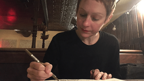
Whether it’s for work or for leisure, Giorgia can often be caught sketching or taking notes. With sketchpad (or iPad) in hand, she is ready to draw anything or anyone that crosses her path. In fact, sketching has become a daily ritual and, perhaps, a bit of an obsession for Giorgia. “I draw before I think…Every dinner or social, I pull out paper and pens,” she confesses. It’s her way of noticing her surroundings and staying focused. “[Drawing] keeps my mind from wandering,” she adds.
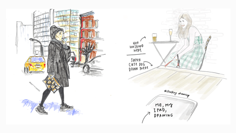
Giorgia’s #stalkingdrawings
Grateful for friends who kindly tolerate her compulsive drawing habits, Georgia has amassed a collection of illustrations unashamedly referred to as “stalking drawings.” Because of her knack for noticing and note taking, she’s captured countless memories spent with friends over beer, pizza, or coffee.
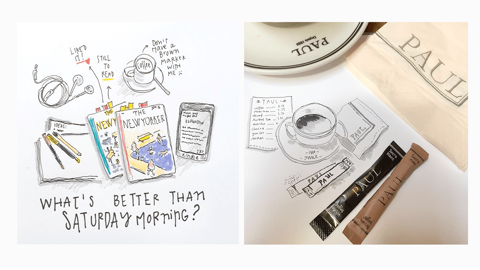
Giorgia’s drawings capture everyday moments
PRO TIP: Use the Evernote in-app camera to quickly snap photos of hand-drawn sketches and handwritten notes on any piece of paper (like a napkin!). Add it to a shared notebook that your colleagues or friends can view or edit. Once saved to Evernote, any legible text in an image is searchable: Learn more.
Organization: Outer order that brings inner peace
Giorgia unashamedly admits that she’s “really, really obsessed with organization.” She adds, “All my papers and pens need be lined up on the table, parallel to each other.” Organization, for Giorgia, has a calming effect. She’s come to believe that, “Not only do we organize to find things easier, but we also organize because outer order brings inner peace.”
“Not only do we organize to find things easier, but we also we organize because outer order brings inner peace.”
This fascination with organization extends to Giorgia’s to-do lists, which she frequently rewrites and reorders. For week 10 of the Dear Data project, Giorgia wanted to find out how frequently she modifies her Evernote to-do lists. To keep her data organized and her visualization meaningful, Giorgia used dashes (–) as a symbol to denote each individual item in a to-do list, with variations indicating attributes and actions for each item.

Giorgia’s visualization of data gathered from the ‘Week 10: To-do Lists’ project
The detailed legends on the back of each Dear Data postcard do more than explain and organize the data. They are also helpful for tracking and identifying weekly patterns and trends, which leads Giorgia to glean deeper insights about performance, human behaviors, and values.
For example, much can be deduced from the patterns found in Giorgia’s “Week of Laughter” drawings depicting ‘laughter’ data. From a quick scan of the ‘Week 42’ postcard, one could deduce that Giorgia has a pretty good relationship with her colleagues at Accurat. They all work together in an office, but also seem to have a lot of fun while doing it.
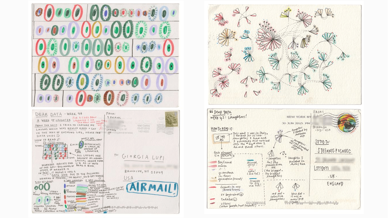
Giorgia’s ‘bouquet of laughter’ from Week 42 (on the left) of the Dear Data book
PRO TIP: Create a good organization system in Evernote by keeping notebooks or tags consistent. This makes it easier for you to find and sort your notes. Using naming conventions with note titles also makes it easier to find and organize notes. Add prefixes, numerals, and symbols to your titles as a way to group similar notes together. To view lists by note title, display your note list using the ‘Side list view,” then sort by ‘Title. Learn more.
Creativity: Drawing inspiration from cross-curricular sources
To cultivate creativity and keep ideas fresh, Giorgia finds inspiration from a variety of sources, including geometry, science, and various elements in nature. She also spends time exploring abstract art, musical scores, and Pinterest boards for ideas. Recently Giorgia and her Accurat team worked on a data visualization project for Popular Science magazine that was inspired by musical notations.
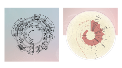
Illustrations from Accurat’s data visualization project for Popular Science
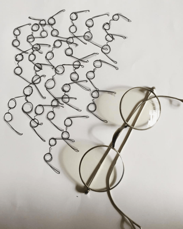
Ideas come and go, in different shapes and forms, at unexpected times, and in unexpected places. Whenever Giorgia finds shapes and patterns she likes, she attempts to draw and redraw them, paying particular attention to the aspects that pique her interest. Even the most prosaic objects can be sources of inspiration: Earlier this year, she spotted a pair of glasses on the table, reproduced it as a line drawing, and proceeded to create a pattern with it.
“…to keep ideas fresh, Giorgia finds inspiration from a variety of sources, including geometry, science, and various elements in nature.”
When Giorgia went about collecting data for weekly experiments, she also needed to be creative and flexible in the way she captured that information. The first day of each week, she might start out by jotting down some notes on paper. If her computer or phone were nearby, however, she’d jot some text notes in Evernote to keep them all in one place—synced to and accessible from all her devices.
Other examples:
- For the ‘Week of Indecision’ experiment, Giorgia used the ‘Reporter’ app.
- For the ‘Week of Belongings’ experiment, Giorgia camped out for some time in her wardrobe to draw the layout of her clothes and shoes in her sketchbook.
- For the ‘Week of Clocks’ experiment, Giorgia took screenshots of a digital clock on her phone or her laptop.
In this way, the process of data collection became as much an exercise in creativity as the postcards themselves.
PRO TIP: Use Evernote on your mobile phone, so you’re ready to capture thoughts and ideas at any time. Save an audio recording of an inspiring lunchtime conversation (with permission of course!). Snap a photo of a wine bottle label at a party. Use your finger to scribble or sketch a digital drawing inside a note. Save an interesting news article to Evernote from your mobile web browser. Learn more.
Clearly, Giorgia and Stefanie are thrilled about the success of their Dear Data book. What’s been even more exciting, however, is seeing how their book has started to change the way people view data.

Now, instead of describing data as ‘boring,’ ‘objective,’ ‘impersonal,’ and ‘complex,’ she meets people who describe it as ‘elegant,’ ‘humane,’ and even ‘whimsical.’ It has been especially satisfying to see a growing community of adults and children all starting to create and post their own data visualization drawings online. People, all over the world, have begun to notice and share personal details about their everyday lives, and in turn, connect with themselves and others more deeply than ever.